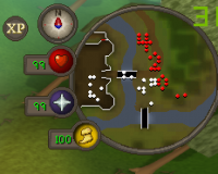
I don't know if this has been suggested in the past, but I would suggest increasing the scale of the buff / debuff timers. That or use a better, larger template for displaying timers on buffs and debuffs. Something like this is so eye straining to those that play on higher resolution monitors~ and probably to those that have some issues with eye sight. I can't stress enough about how painful it is just to lean forward and squint your eyes just to read important screen information because it's so small. If anything, you can try using something like OSBuddy's template. Large, recognizable immediately, and it demonstrates a clockwise radial timer that is easy to read.
** I also understand that you can just change your monitor's resolution to something lower so everything is easier to see, but that shouldn't be a go-to option. It definitely shouldn't be the only thing you can do either if you're multi-tasking. Sacrificing monitor resolution just to read important information is absolutely mind numbing. Hopefully we can change this as soon as possible! Oh yeah, I also know there isn't any debuff timers but... wouldn't that be nice?
![]()




 This topic is locked
